

"The more uninteresting the letter, the more useful it is to the typographer."
Piet Zwart was born in Zaandjijk, the Netherlands on May 25 1885. In 1902, he studied at the School of Applied Arts in Amsterdam which was influenced by the principles of the English Arts and Crafts movement.
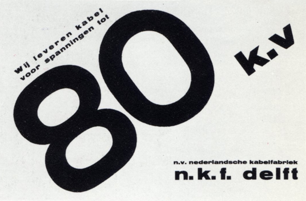
He started his career as a graphic designer in 1921 and designed stationary for Jan Wills. It's clear that architecture and De Still movement had influenced him a lot. Zwart also influenced by Dadaism and International Avant-Garde, especially Russia Constructivism.
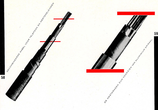
In 1923, Zwart met Schuitema and El Lissitzky. He used a new method of photography ,photogram, but it came short since he didn't feel the pictures work well for his work.
Piet Zwart was the first graphic designer from Dutch that I knew. The geometric shapes and composition have drawn my eyes to his work. His choice of color gives a nice touch to the artwork, simple but striking. One of my favorite of his work is his logo. The logo represents him a lot. The combination of the beautiful letter of P and perfect square is balance very well. Even though he never called him a photographer but I show some of his pictures. He is a talented man that I really respect. He combined the pictures and typography to make a new visual culture. He called himself as an interior designer, industrial and graphic designer or "typotect'. His background as an interior designer gives me encouragement since I had an interior background as well.
Piet Zwart is one of the most important Dutch graphic designer. His work are simply amazing.
Some Images courtesy of Icongraphis and MoMA
